Ding
Creating HomeServe's Disruptive Sub-Brand
HomeServe was gearing up to launch a new home-repair subscription service. But before they could introduce it to the world, they needed more than just a great product – they needed a brand that customers would trust, remember and love. A brand built to last. That’s where we came in.
Working closely with HomeServe, we uncovered and distilled the core function, promises and aspirations of this new product. With an exciting and strategic foundation in place, we then crafted a compelling brand identity – visually and verbally – that truly resonates with customers.
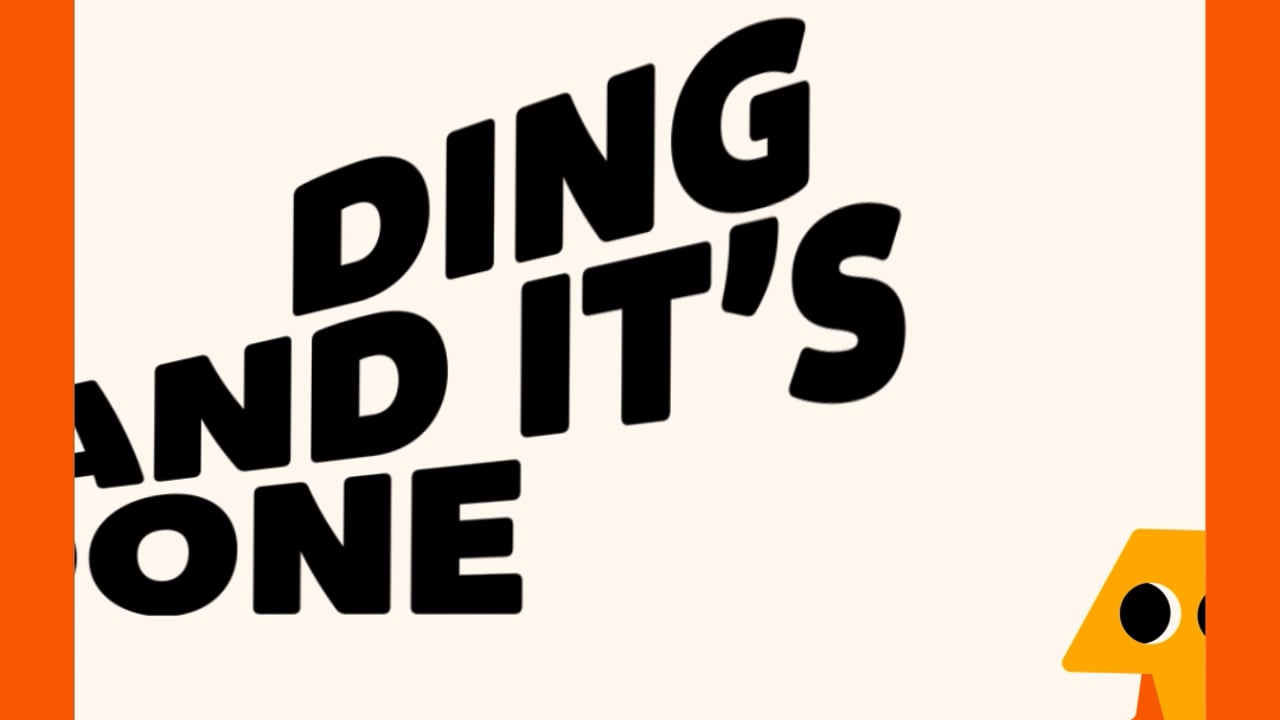
Enter DING. A brand that’s as easy to call upon as it is to remember.
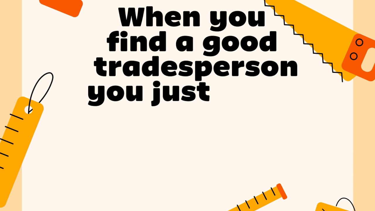
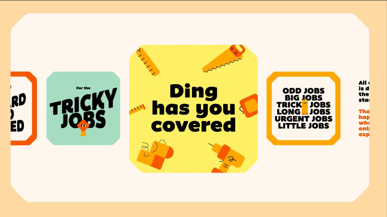
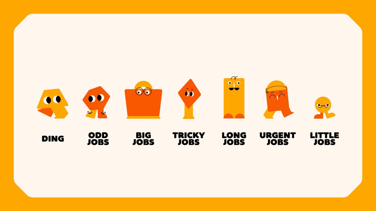
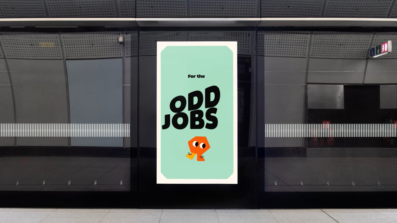
Whatever the job – big, odd, important, little or long. Just DING and it’s done. Built on a confident, neighbourly and chipper personality, the brand world was carefully designed to maximise recognition and trust.
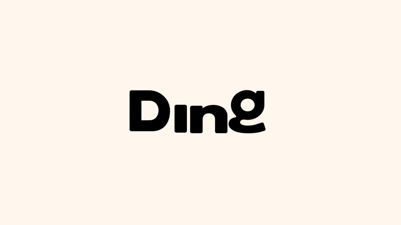
Whilst many expertly orchestrated design choices contribute to its success, a few standout elements sharpen the story: 1. The name, DING cloaks the brand in a playful, speedy and helpful tone. 2. Our namesake Mascot, animated to personify simplicity, warmth and adaptability. 3. A robust, expanding headline font designed to balance reliability and motion.
A name, a look, a promise – DING makes home repairs feel as easy as it makes them.