Creative Inspiration Monthly – #10
The cosmetic & beauty industry is the perfect place to look for some fresh, fun & modern branding. From hair salons to toothpaste, we’ve spotted a few new rebrands that have caught our eye. Check them out below…
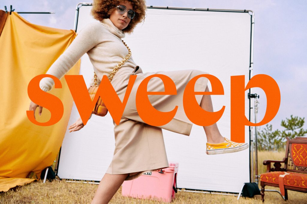
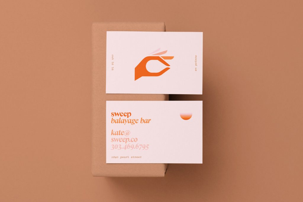
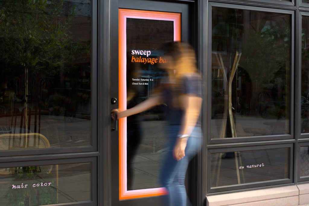
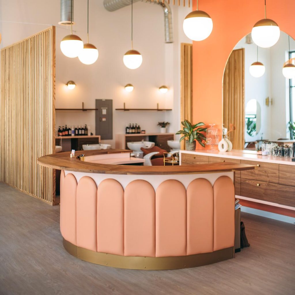
Sweep
By the guys at The Office of Ordinary Things, based in San Francisco, Sweep’s rebrand pulls inspiration from the 70s & the hair colouring technique ‘balayage’. The brand features a colourful gradient and bold typography which certainly makes the salon stand out from its peers.
“The chemicals used in the balayage process—gentler on hair as well as the environment—give the hair a more natural, “sun-kissed” look. This inherent quality gave way to the brand’s signature 70s-inspired sunrise motif which is integrated throughout the brand in the form of borders, badges, and illustrations.”
We especially love the use of Colombia Sans for the logo. Super simple and clean but still retains personality. A brand that’s really on trend at the moment!
See the full case study here
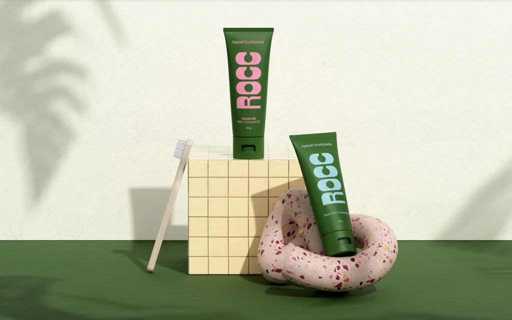
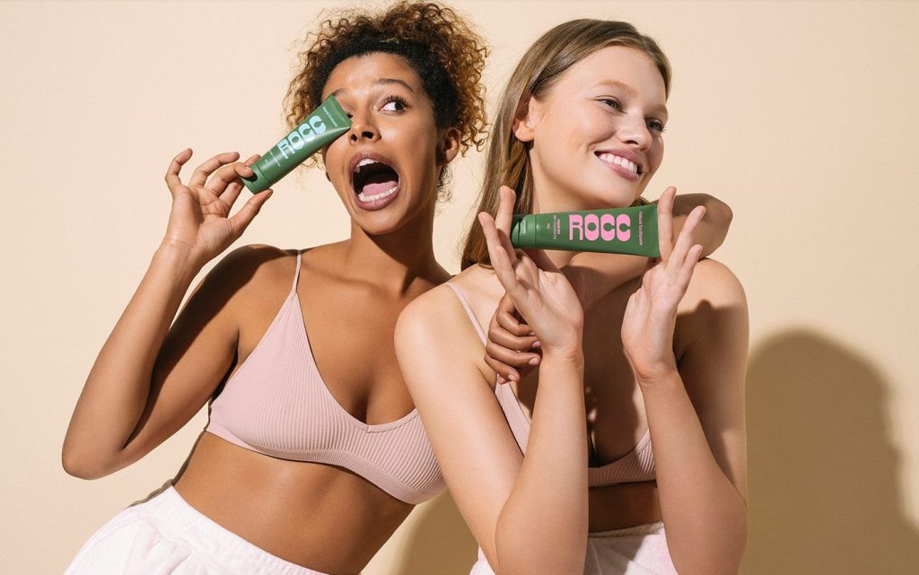
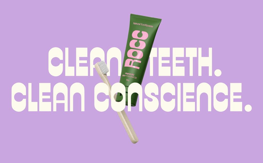
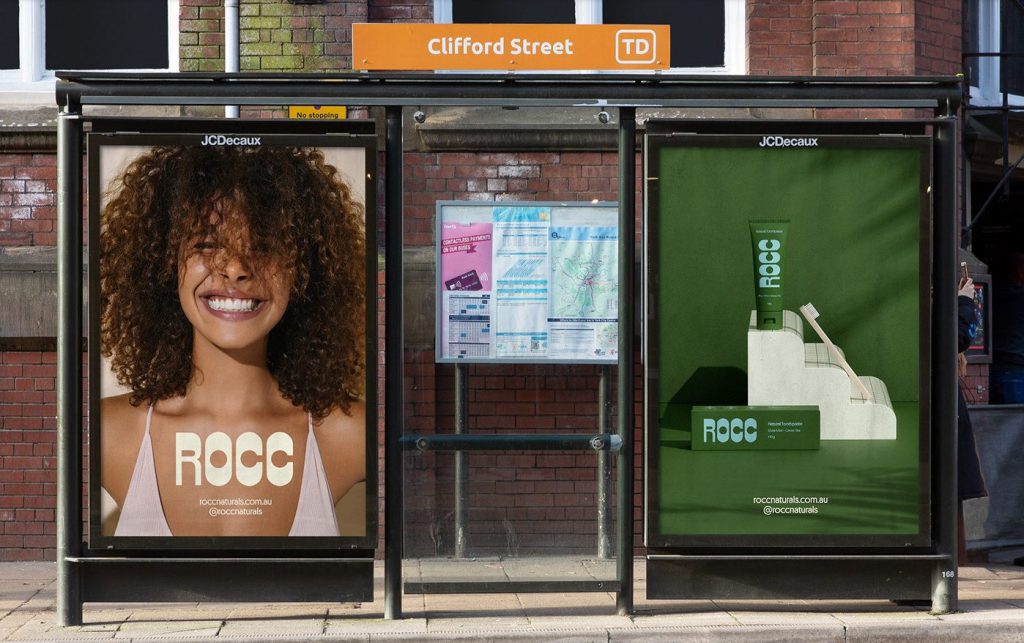
Rocc
Rocc is an all-natural toothpaste brand that stands out from the crowd. Designed by Australian agency Date of Birth, their branding and packaging is funky, bold and totally different to anything else in their category.
“We were done seeing the same “natural” recycled look on other brands, and created a visual identity that looked both nostalgic and brand new at the same time. Something you would love to have sit proudly on your sink, not in your drawer.”
The tube is also biodegradable and can break down in as few as six years. Nice to look at & environmentally friendly, what’s not to like?
See the full case study here
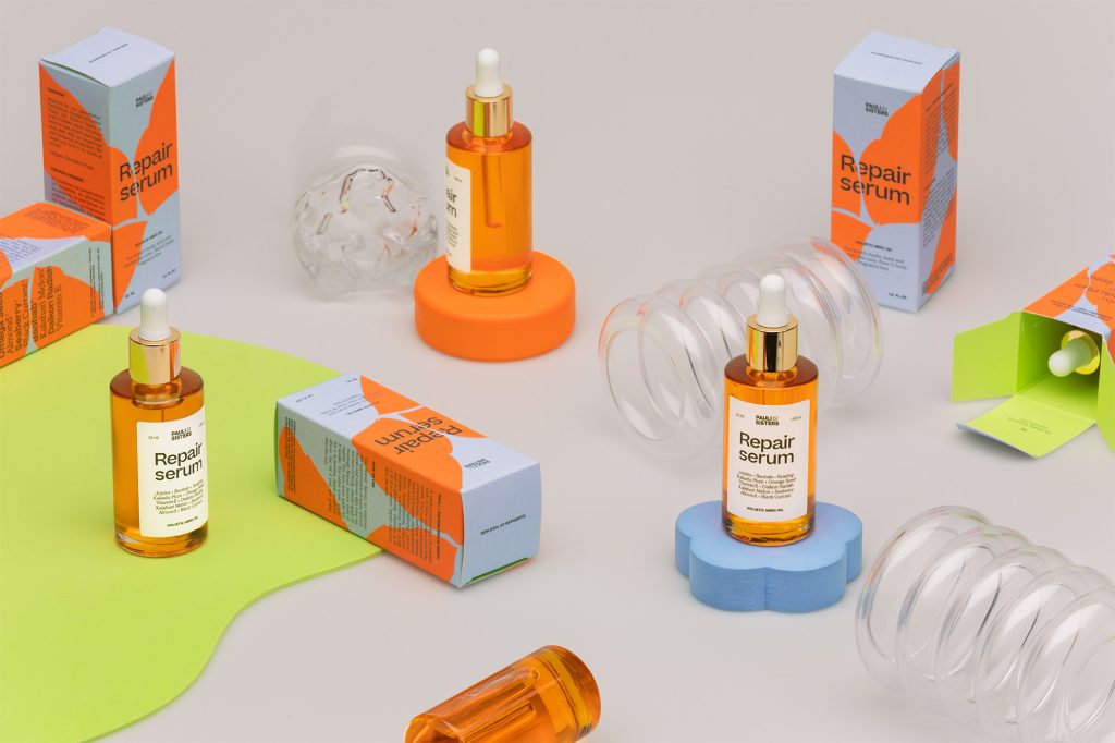
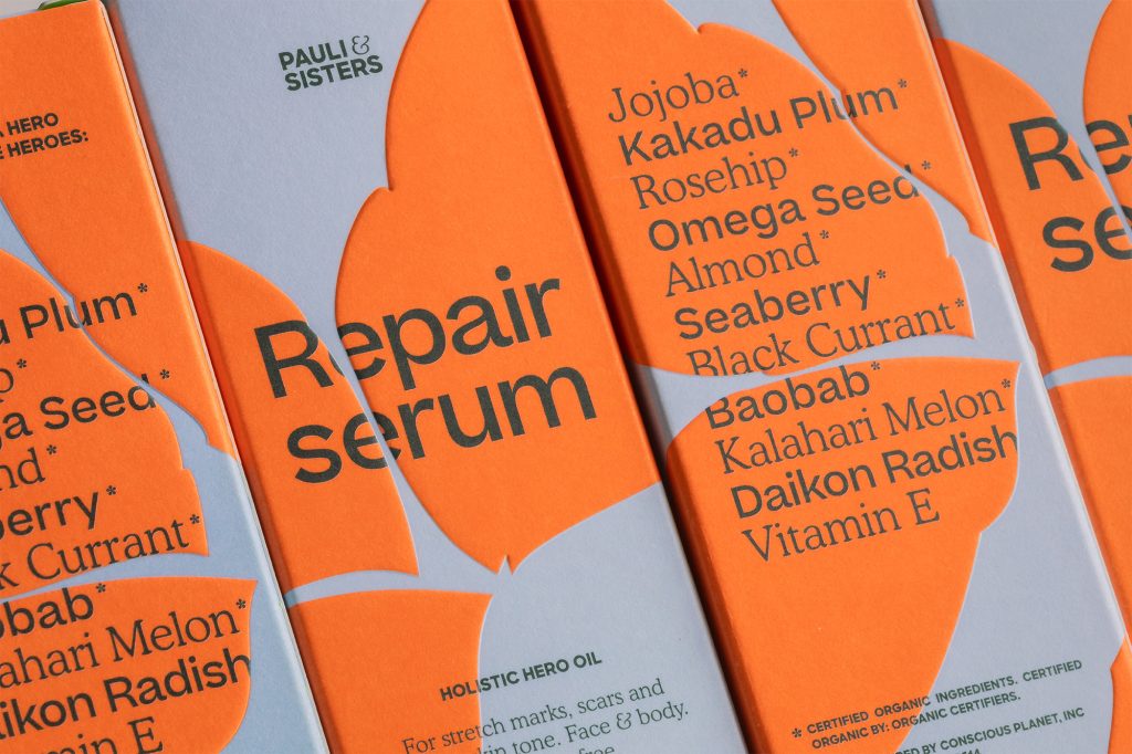
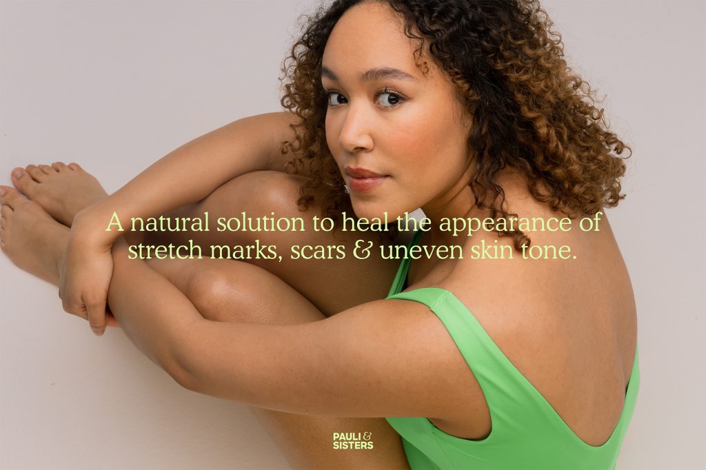
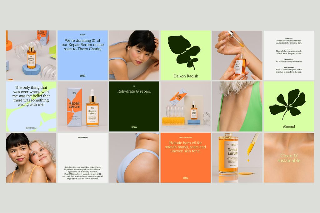
Pauli & Sisters
Another bright and colourful one for you, Pauli & Sisters is a Californian skincare brand. Studio Marina Veziko are behind the branding and are killing it with the vibrant colours, quirky typefaces and stunning photography.
“The slogan being “Guardians of your skin”, the abstract leaf shape pattern on the packaging is highlighting just that – hero ingredients from natural origins protecting and healing your skin.”
Overall they’ve crafted a really beautiful brand that stands out from the rest.
See the full case study here
This is too many words. I would like to leave
↙ Back to ThoughtsThe 12 Best Creative Agencies Every Brand Should Know in 2025
The 12 Best Creative Agencies Every Brand Should Know in 2025 Finding the right creative agency can make or break a brand. The best agencies do more than deliver visuals—they translate ambition into clarity, tell stories that stick, and create work that resonates in a crowded world. But the challenge? There are thousands of studios … The 12 Best Creative Agencies Every Brand Should Know in 2025
Good rebrands start in Figma. Great ones start in the room.
When brands come to us asking for a new rebrand, they typically want a brand mark, colour palette, typography and motion design, as well as a handful of marketing templates. What we give them is a 3-4 month collaboration that involves a lot of upfront groundwork: talking, research, thinking, asking and listening. When we meet … Good rebrands start in Figma. Great ones start in the room.