Brilliant Planet
The Client:
Earlier this year we travelled from Clerkenwell to Morocco for a new project.
Brilliant Planet operates a unique sustainability model in the remote desert of Akhfennir, Morocco. Here, they create giant ponds and harness the natural power of algae to capture CO2 and convert it into stable biomass.
Their team approached us to design them a brand-new identity and website: including photography and video production. We said yes.
The Challenge:
Brilliant Planet is a trailblazer; it is also well-funded and professional. This isn’t a scrappy start-up. From our first session with the team, it was clear that their biggest need was to move their public perception from early to established.
The next big challenge identified was to define an optimistic, yet serious message. The team were not interested in the (perhaps justifiable) scare tactics popular in the sustainability space. Instead, they hoped to captivate audiences with what they are making possible.
The Approach:
After in-depth project immersion, we decided upon a strategy that would position Brilliant Planet as:
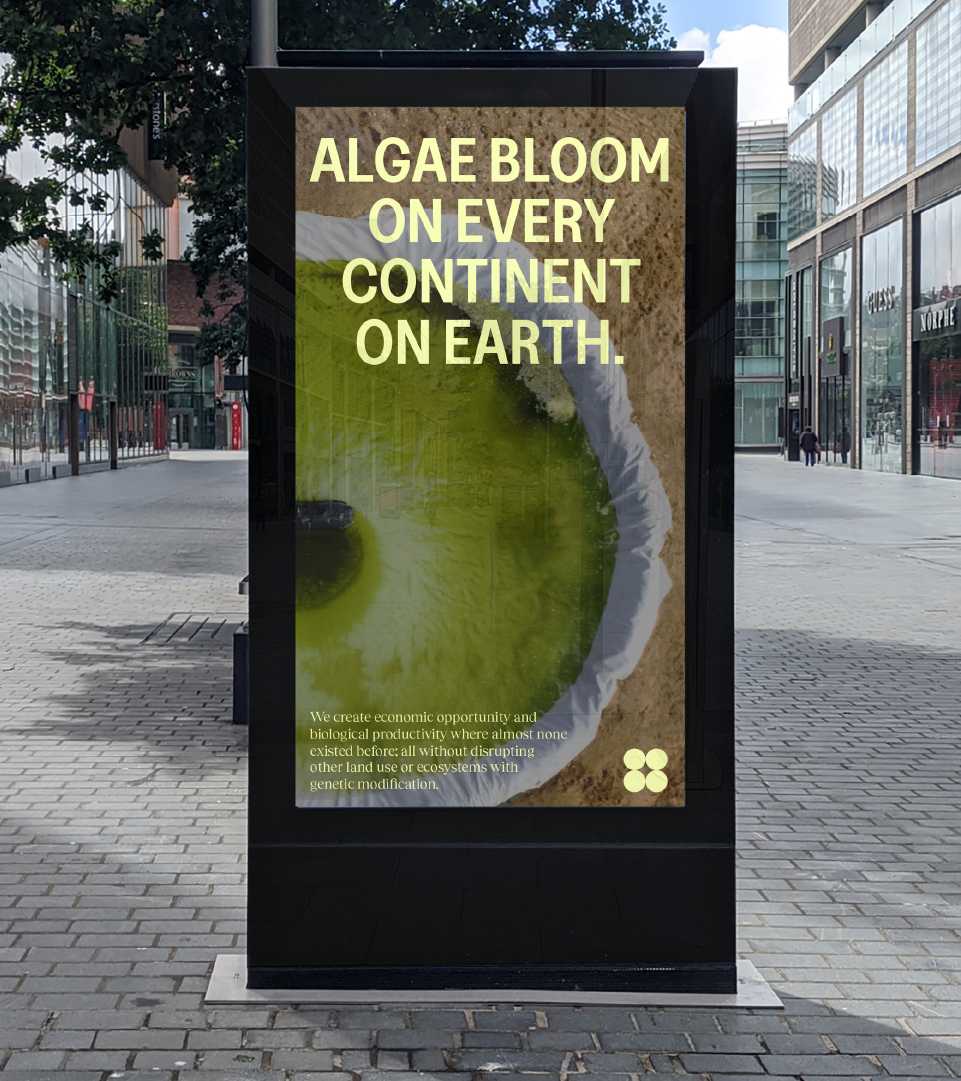
Scientific: By taking creative cues from nature-based publications and science journals; we would set a tone of both authority and passion.
Compelling: Brilliant Planet brings together the micro and macro: shifting focus between the two. We knew this cinematic scale, movement and gravitas would be what pulled in audiences.
Clear: We wanted an honest yet dramatic tone to the identity. Intentional, academic and confident.
The Creative:
To capture the action, our team travelled 7-hours deep into the Moroccan desert for an ambitious shoot at the Brilliant Planet algae facility. Collaborating with local production teams, we captured the whole facility on 4K cameras and drones, bringing the Brilliant Planet story to life with content that could be blended into the new identity and site.
The brand’s colour palette was dictated by this world. We pulled rich tones from these desert landscapes and paired each with a more studious, pastel shade for accessibility.
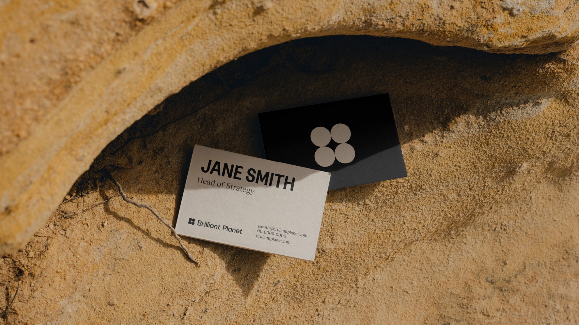
The client was set on having a plethora of meanings incorporated into their brand mark. We also needed to create something capable of holding its own both over cinematic photography and amongst dense copy; the final result also became a unifying graphic device throughout the identity.
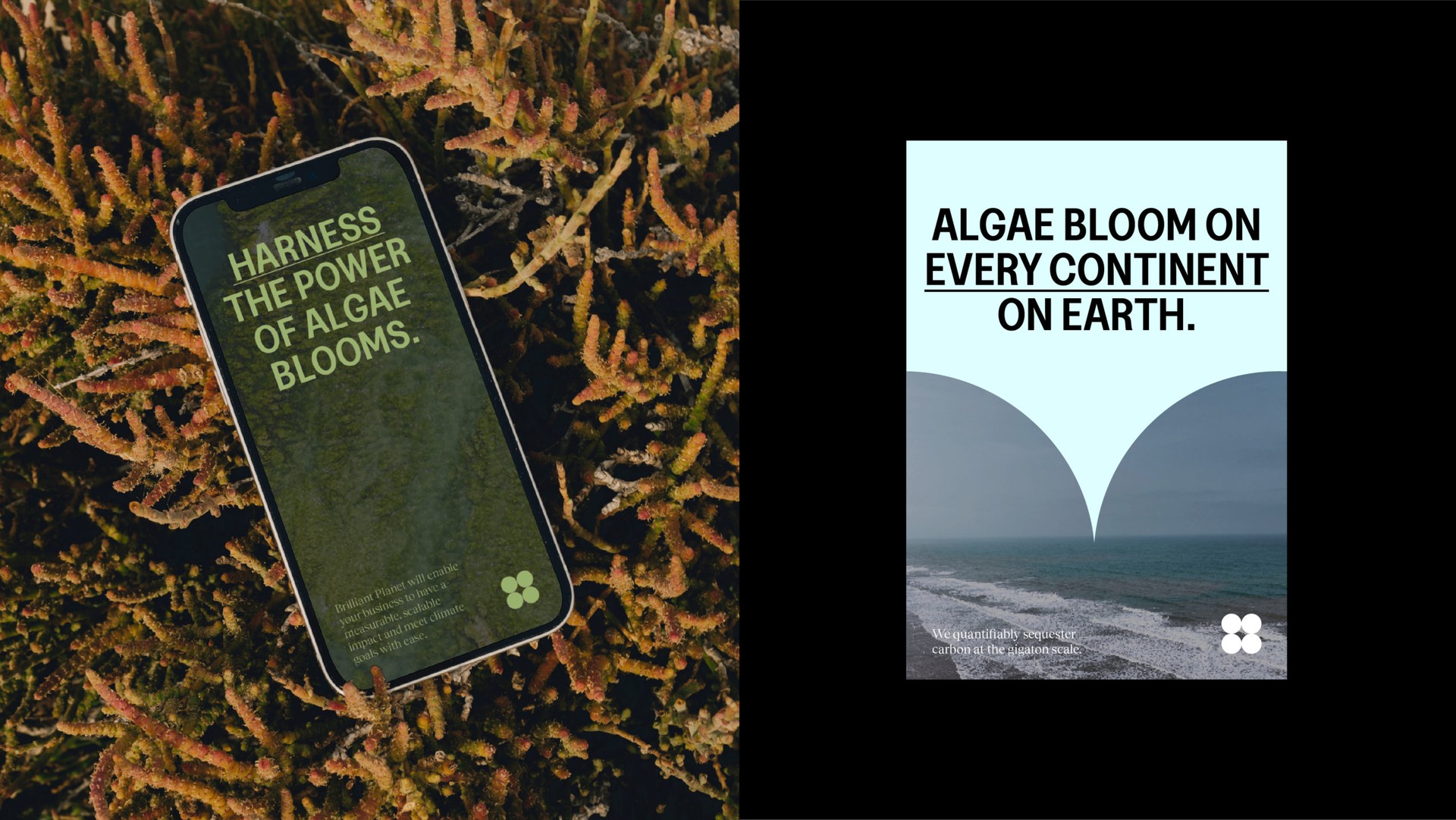
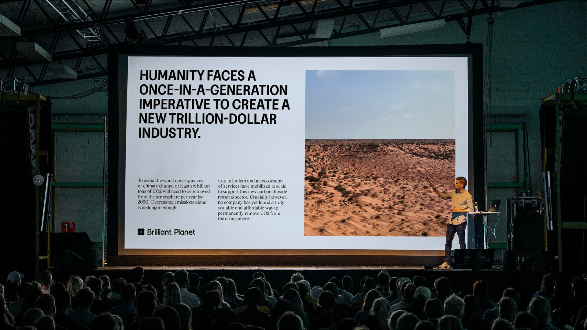
The brand’s typography and structural formatting is the element most heavily inspired by our editorial design references. Capitalised, bold subtitles are followed by dense and serifed copy blocks. For the wider brand story and sub-header TOV, we use detail-rich statements that act as another nod to these academic influences.
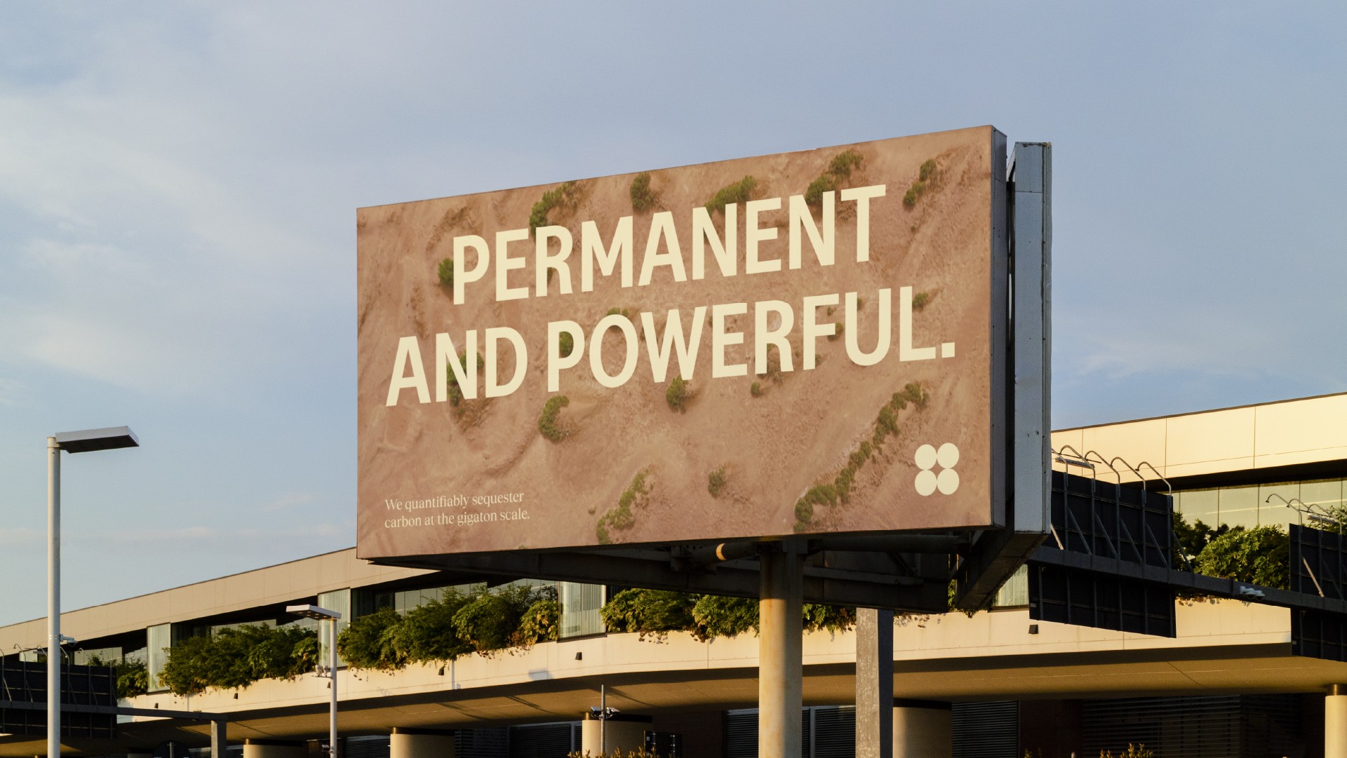
“Permanent and Powerful” was introduced as a tagline to ground the energetic brand name with something weightier. It performs as a simple, but bold overview of their market USPs: measurability and scale.
The ID was completed with our lead CTA: The Future = Blooming. In functional terms, this play on ‘Business is booming’ references the rapid growth of algae blooms. On an emotional level, it encapsulates Brilliant Planet’s optimistic and expansive ambition.
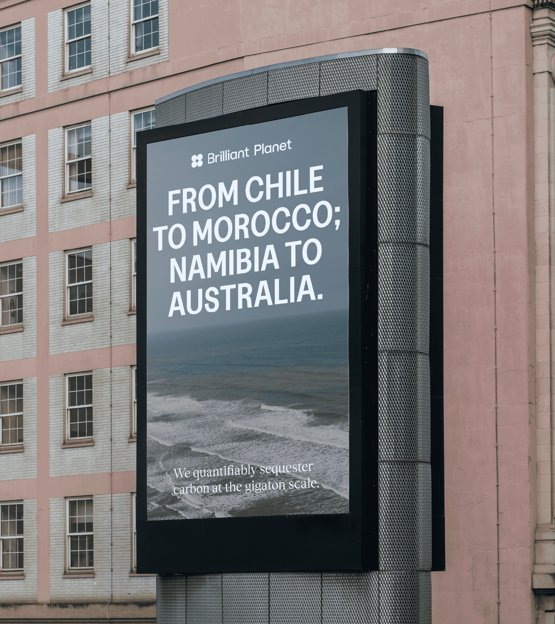
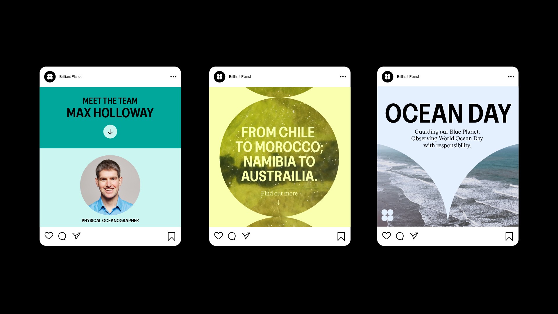
In collaborating with Brilliant Planet, Wildish & Co. seamlessly wove design with purpose. As the global community seeks innovative solutions for a sustainable future, Brilliant Planet leads the charge, armed with a brand that genuinely mirrors its mission.
Want to work with us?
Drop us a line
